For today I have just a super tiny tip.
Sometimes, your dataset only consists of data like [city name], the [latitude] and the [longitude]. No further information available.
If you put that on a map, Tableau will automatically draw the dots and the map in the background like this:
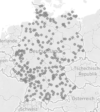
That is ok but not really great.
An easy option to at least somewhat beautify this without any further data prepping is to just create a calculated field. Write “Germany” in it. Select it on the data pane, set the Geographic role to “Country”.
Put it on the map as a new layer. Now you have several options. You might outline the country you are looking at or use the new layer as a background. We can even remove the map altogether and only show the country with its outline.
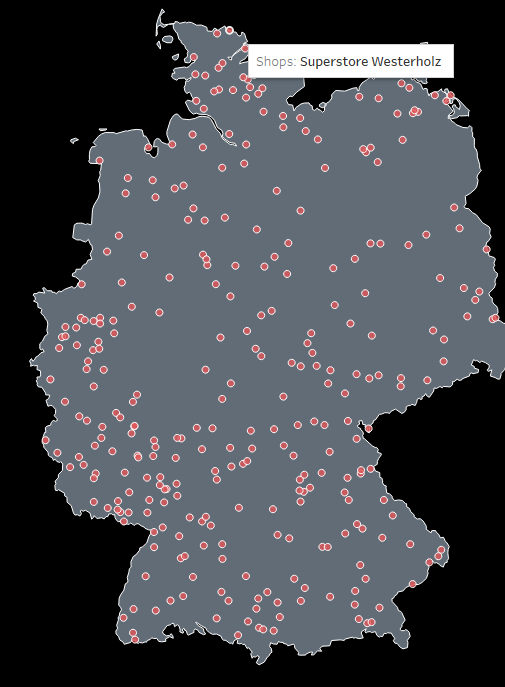
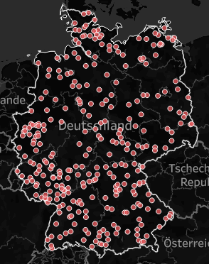
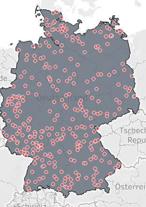
Nothing spectacular, but every now and then it might come in handy.
And that’s it for today.
I hope you find that useful.
Until next time.
Steffen

Leave a comment