Today we are going to deal with a request that recently popped up during our work.
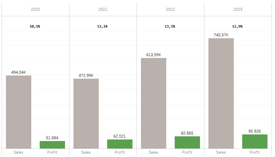
The question was how to put a ratio above two bars from two different measures that are grouped by year. Like this:
Either, there is nothing on this topic or we are very bad at googling, but in any case, here is the solution I came up with. Be aware, it is not really pretty, but it serves it’s purpose.
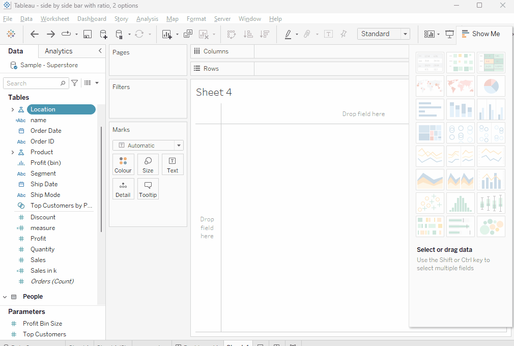
Create the base chart
Start by creating a side by side bar chart (I am using sample superstore) . You can – for ease of implementation – jus keep ctrl pressed and then select [order date], [sales], [profit] from your data pane. Then use show me and click the suide by side bars, done.
So, from here we now want to get the ratio on top the two bars, mid aligned.
We are facing two problems here:
- year or order date is discrete which means we do not have any means to derive the middle point of sales and profit.
- Also, measure names is being used and we cannot directly target measure names in any calculations.
What you do next is to add a secondary axis as you may have envisioned already.
Simply add avg(1) by double clicking into rows, then click dual axis. Take note of what happens once we click dual axis:

The avg(1) becomes part of our measures (though not in the “measure values” card).
But that is neither what we want, nor what we need. No matter what we do, change it to square, dot, whatever, it just stays there as a third bar/square/circle.
But watch what happens if we change it to line and then add [measure values] to the path:

Our avg(1) is removed as part of the measure names (where it never really shows..).
We can even turn it back into something different but I like to keep it as a line.
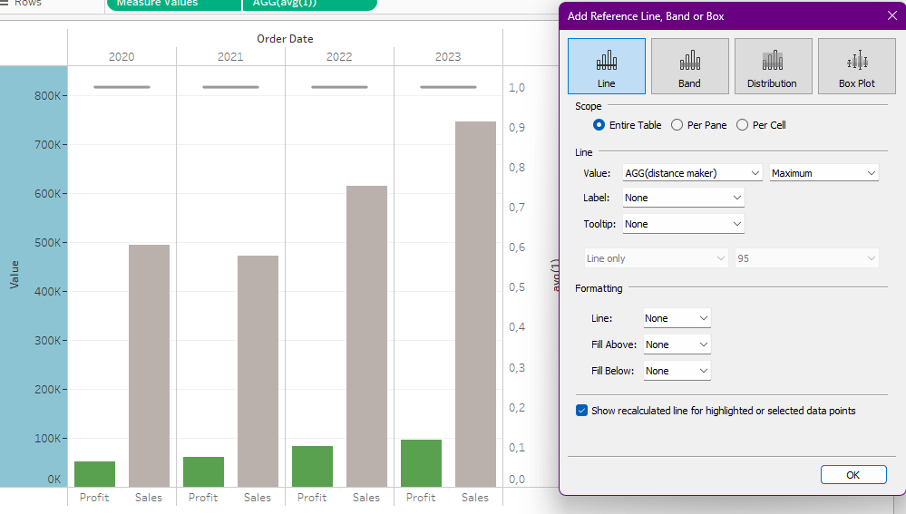
Next step is to create a fake reference line because as you can see above, our avg(1) and the right hand side sales bar 2023 collide.
I used this calculation
//distance creator
max(sum([Sales]), sum([Profit])) * 1.1
put this on the details of the bar chart, right click the axis, create a reference line like this:
Now, go to your line chart (avg(1)).
Put [Profit Ratio] on the label.
Click label and select “line ends”, only tick “Label end of line”.
(you might want to format your profit ratio to a percentage).
Make it left aligned.
From here, we are already almost done but you will notice the alignment is not really perfect (and never will be) as the problem is that we have two marks. line beginning and line end, but no mark in between (and – at least not that i’d know how – we can’t get it)

We need to artificially move our label towards the mid of our two ends.
Adding white spaces does nothing for us, they are just being ignored. Instead, use a blank unicode character that you can find here: https://www.compart.com/de/unicode/U+2800
Simply mark it, copy, and paste into your label. Make sure to adjust the sizing!
Repeat as often as required to move your labels round about mid way of the line chart. Be wary of the fact that when putting your sheet on a dashboard, it might resize therefore requiring adjustments on your manual alignment.
Finally, click color and set opacity to zero and we are done.
That’s it for today.
I hope you found that useful.
As always appreciate your feedback. Are you aware of any other options? Do I just suck at searching the web? Let me know in the comments, I am always happy to learn!
Until next time.
Steffen

Leave a comment