In the last episode we learned how to do a year-over-year comparison when only two years are in the game.
However, there may be cases when you want to show multiple years and their year-over-year development in a table – mostly this is something that senior management wants (why the heck do they love tables that much?) and whilst we are on it, they usually prefer an Excel’eske layout.
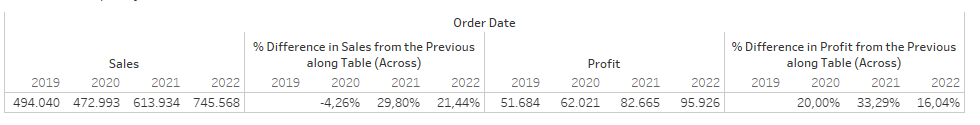
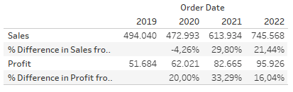
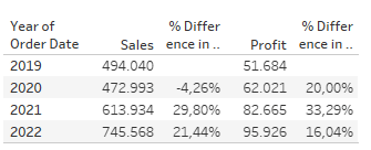
What do I mean by that? Consider the next three screens which show some ideas what Tableau will offer you out of the box. All workable solutions, but often not close enough to what management wants
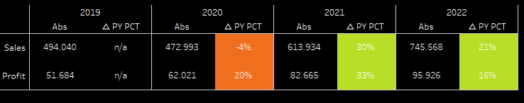
What they usually request is more like this because that is what they are used to from their Excel tables where you can manipulate any individual cell instead complete rows and columns.
There are some options to achieve this kind of layout and today we will be using
Unioning your data to achieve the required layout
In order for this to work you need to start in your data source tab.
Drag your data source to the tables area, then double click it to get to the physical layer. This will be indicated by a box around your data source.
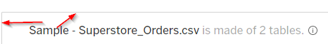
Here, drag your data source a second time onto the data canvas until you see the “union” popup
From here, go to your sheet and start by building two calculations (for simplicity reasons, we will go with the difference, not the percent difference)
//Calculation Profit
if attr([Table Name]) = 'Sample - Superstore_Orders.csv' THEN
sum([Profit])
ELSE
SUM(if ([Table Name]) = 'Sample - Superstore_Orders.csv1' THEN[Profit] end )
- LOOKUP(SUM(if [Table Name] = 'Sample - Superstore_Orders.csv1' THEN[Profit] end ), -1)
END
Recreate the same for the [Sales].
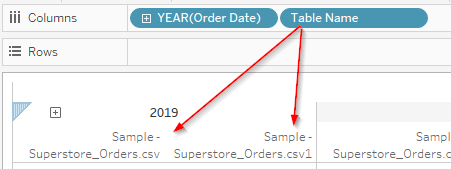
The trick we apply here is to make use of the new column that we get by unioning our data.
This allows us to apply two different calculations per dimension by which we slice, see the following screenshot to better understand what I mean here:
So, let’s build this.
Put year([Order Date]) on the columns as well as the new field [Table Name].
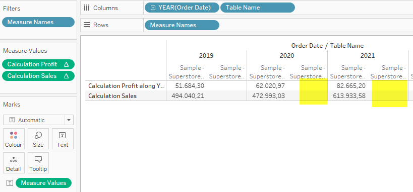
Double click your two created calculations to automatically move them to the measure values card -> Tableau will automatically add [Measure Names] to rows and [Measure Values] to the text card.
Now, the final step (prior to some visual tuning) is to adjust the calculations – they are table calculations after all. You will notice that we have only blanks where we would want to see delta values:
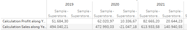
So, right click the two calculations and go to “Edit table calculation”. Untick the “Table Name” and leave Year of Order Date ticked. This will tell Tableau to partition by the table names and do the calculation addressing each year.
Therefore, the calculation is now able to to the second part and we get, what we want. And with that, we are as good as done:
Lastly, all we need to do is some cosmetics, for example aliasing. To do so, right click the calculation names on your view and give them better names. Then, right click the [Table Name] pill and again select “Edit Aliases”.
Our final result will look like this
And with that, we are done.
In the next part of the series, we will be looking at an option of how to do this when unioning your data is not possible and whilst we are on it, we will expand a bit on the formatting as well.
I hope you found this useful and as always appreciate your feedback.
Until next time.
Steffen

Thanks for this fantastic post. My question is can you plot this and also how do you display this on a dashboard ?
LikeLike