In the previous post we had a look at how to do a series of year-over-year comparisons using a self-union. But what if you can’t use a self-union, for example because your data source does not allow you to do that?
Also, we wanted to have a bit more insights into how to do some nicer formatting.
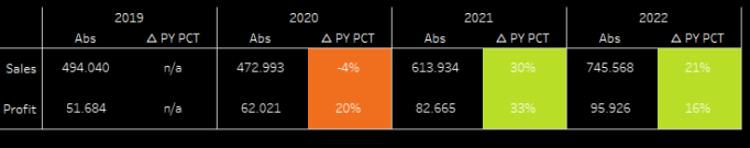
Reminder: this is what we want to achieve at the end, filterable by year and region:
So let’s get started.
Making use of internal data densification
We need to find a means that we can use to basically mirror what we did with the union in the previous posting. There, we made use of the new column [Table Name].
The solution to this challenge is what is called internal data densification. We basically make use of our data to derive an additional column that allows us to create what we need.
Kindly note that going into all the depth of internal data densification is far too much for this blog post so I will link a superb post on the issue at the end of this entry.
Start by connecting your workbook to Sample Superstore.
Then, create this calculation
//internal data dens
if [Product Name] = 'Staples' then 1 else 2 END
The reason I am using “Staples” product is because it is available in every region in every year. Again, read the linked article later on!
Next on our to-do is to create calculations for sales and profits just as we did in the last blog post. This time, however, they are slightly different. One reason being also that as you can see for fun’s sake we are using the delta in percent year-over-year
//Sales calc
if attr([internal data dens]) = 1 then sum( { fixed YEAR([Order Date]): sum([Sales]) } )
ELSE     ( sum({fixed YEAR([Order Date]): sum([Sales]) }) /  lookup(sum({fixed YEAR([Order Date]): sum([Sales]) }),-1) -1) * 100
 END
Duplicate this calc and replace [Sales] with [Profit] where needed, name it [Profit calc].
Next, a bit of design:
//uiux - header
case [internal data dens]
when 1 then 'Abs' else '△ PY PCT'
END
You may realise already that his one could basically be used instead of the internal data dens calc, merging them into one. This is just me, i like to separate what I call uiux fields and those that do the actual work in the background. Feel free to do it your way. With this, we can
start building
Put [Order Date] and our [uiux – header] field on the colums.
Double click [Sales calc] and then double click [Profit calc].
Left click-hold the uiux headers and swap them around so that the the delta is on the right.
You should be here now:
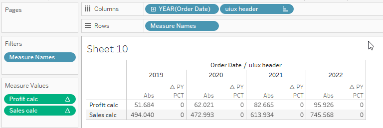
Next, add [Region] and Year([Order Date]) to your filter shelf. Set them to Context!
Notice anything?
Right, we are missing values for our percent delta column.
Right click your measures ([Profit calc] and [Sales calc]) and click “edit table calculation”.
Select “specific dimensions, then tick Year([Order Date]) and untick [uiux header].
Now you should see this:

Getting closer, but not there yet. We are missing the percentage sign, the coloring, we also got an n/a in the above screenshot that we do not yet have in place and our labels are also not nice.
Formatting
Start with the coloring
//Coloring
if attr([internal data dens]) = 2 THEN
sign([Sales calc])
END
So, this will check in case our internal data dens returns a 2 if our result of our [Sales calc] is positive or negative. In effect, this will give us three options we can play with (because our internal data dens can also be one). Again, right click, edit table calculation, specific dimensions and do as above.
From here, format your colors as you see fit. I have used an “invisible color” for those parts where the formula returns null as I only want to color the deviations.
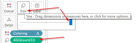
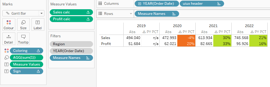
Next, change your marks type to Gantt Bar, double click into the marks card and write “1”, close with enter. This will give you an adhoc calculation with a simple sum(1).
Drop that sum(1) onto size, click the size mark and maximize it:
Ok, on to the last part. Create this calculation
//sign
if attr([internal data dens]) = 2
AND ISNULL(lookup(sum({fixed YEAR([Order Date]): sum([Sales]) }),-1))
THEN 'n/a'
elseif  attr([internal data dens]) = 2 then '%'
END
Put on label, adjust your text mark so that it goes behind the <measure values>. Do the “edit table calculation” as you know by now.
Lastly, click your measures, select “edit alias” and name them appropriately. And with that, we are done:
You can now filter by region and year if you want to (year might not be sensible given that this is intentionally meant to show several years in a series but whatever..).
On to the…
Questions you may have
Q: what are the pitfalls of this approach?
A: It requires specific knowledge of your data source and may not be adaptable if your filtering needs contradict the “must be always available” condition that our data dens dimension must meet.
Q: Why do we use “Staples”?
A: Because staples is available in every combination of region and year that we look at.
Q: Why do we use context filters?
A: Because we are using LODs so in order to correctly filter, we need context filters here (check the order of operations when in doubt)
Q: Why do we use LODs?
A: Because we are doing the internal data densification on a row level. That means, if we do not use LODs then we would only get the sum of sales of Staples. We could, however, use an exclude lod instead of fixing but most people are used to fixing instead of excluding so I chose that.
Q: Why is the Sign calculation using an LOD lookup?
A: For the reason outlined above
Q: I want percentage with decimals and absolutes without decimals, how to?
A: That is another challenge. Since we are using a measure per row, that basically fixes our basic number formatting. So, if you want decimals, both would have to go with that. Or, you could convert everything to strings and come up with some fancy calculations to turn the numbers into well formatted strings but I usually consider this too tedious.
Q: What is the color code for the invisible color?
<workbook>
 <color-palette name="Transparent White" type="regular" >
        <color>#FFFFFF00</color>
    </color-palette>
</workbook>
This needs to be saved in your preferences.tps
Q: Can I use different color conditions for my measures?
A: yes.. and no. You can of course move measure values to color, right click the colour bubbles and select “separate legends” but that will just give you little extra to work with in my opinion. However, it might be suitable for your specific cases.
Q: Where can I read more about internal data densification?
A: Right here: https://vizjockey.com/2019/09/05/manifesto-of-internal-data-densification/
And that’s it for today. I hope you found that useful and as always appreciate your feedback.
Until next time
Steffen

Leave a comment