In today’s question from the forums the user asks
(I want to) select any point on a graph in dashboard [..] and can sheet 11 [then] show all data from the manufacturers that make up that point?
The graph on the dashboard was a profitability line chart by months with Category and Sub-Categories on rows. Also, adding to the challenge, the user had a trendline on the chart.
So, there are no manufacturers in the view (yet), but the user wanted to show all the manufacturers with all their data that are included in any given point in time for the resulting profitability
The first challenge is that we want to show EVERYTHING that relates to manufacturers within a selected month, category and subcategory but without limiting those manufacturer data to category, subcategory and month.
Second challenge is: we need the manufacturers in the view but not on the view since otherwise, we lack the information which manufacturers are active in that specific month.
Third, we need to do this but keep only one line that, however, equals the overall value if we aggregate on sub-category/month level and not on manufacturer level.
This means, we cannot simply use a filter as this would always filter down to the values that match category, sub-category and month and thereby contradict the intention of showing everything.
So, here is what we will use:
- Exclude LOD
- Table calculations
- Parameter
- Set
- Parameter Action on the Dashboard
So basically: all that Tableau has to offer.
First, we put manufacturer on the details.
This will give us a multitude of lines per manufacturer.
Second: create an Exclude LOD
{Exclude[Manufacturer]:([Profit Ratio])}
This will ignore the manufacturers for our calc.
Third, remove all but one manufacturer per category / sub category:
We can use an index function that you have to put on the filter shelf, set compute using to “Manufacturer”. Set it to value = 1 so we only keep the first row. Since we use an exclude lod, that does not matter.
Side note: we keep that filter because we also want the trend line which would be showing different results if we keep all manufacturers ON the view (check the order of operations when in doubt why that is). The actual profit ratio line does not really change, it just grows a bit thinner / fatter depending on how many indexes you include because the lines will be overlayed onto each other in our final product.
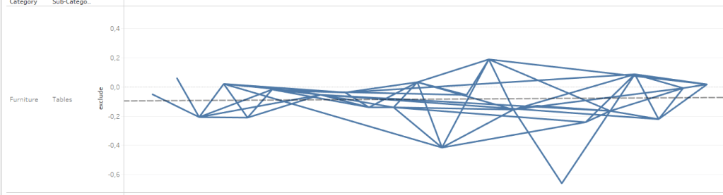
Up to this point, your view might look a bit strange, something like this:
Step 4: get the line to calculate correctly
Put index on the path and set it to compute addressing every single dimension in the view:
Make sure your month of order date is on top – in addressing, order matters!
This is starting to look good:
Step 5: create the desired click functionality
Create the following three calculations:
    //Delimited Manufacturer
    "|" + [Manufacturer] + "|"
//Manufacturer List
PREVIOUS_VALUE(ATTR([Delimited Manufacturer]))
+
IF CONTAINS(PREVIOUS_VALUE(ATTR([Delimited Manufacturer])), ATTR([Delimited Manufacturer]))
THEN ""
ELSE ATTR([Delimited Manufacturer]) END //Final list
window_max([Manufacturer List])Step 6: Make the calculations do their job
Put Final List on the details and edit it to be computed by manufacturer. Be aware it is a nested table calculation, both calcs need to have manufacturer checked! If you add it to your tooltip, you will already see this (see first line)
Steps 7 and 8 Parameter and Set
Step 7 is to create a parameter (string, empty), -> p.StoreValues
Step 8 is to create a set based on this condition:
CONTAINS([p.store_values], [Manufacturer])Step 9: Create the Action
Go to your dashboard and create a parameter action
And that is it.
Clicking a mark will now send the final list of manufacturers to the parameter which the set can then draw from to check the condition and be filled.
Use the set as a filter on your details sheet and you are done
If you want to follow along find the corresponding workbook on my tableau public here:
That’s it for today, I hope you find that useful.
As always, I appreciate your feedback.
Until next time.
Steffen

Leave a comment