Apparently, this week is the week of table calculations in combination with parameter usage. Well, its a powerful combination.
The challenge
A while ago a user wanted to be able to show in a tooltip the deviations of the running sums of his actuals vs the running sums of several different budgets, depending on which budget the user would be hovering over.
This poses immediately two problems
- Several budgets that we compare to the actuals which means we have to tell the tooltip which budget we are looking at
- Tooltips pass filter on the level of dimension filters. Table calculations such as running_sums get calculated after the dimension filters. This means, the tooltip would never show the running_sum up to the date that is being hovered upon but only for that specific point in time.
On 1) we have to note that the way the data was structured he had a date column as a dimension and four measures columns with the actuals and the three budgets (call them a to c).
One could have thought about pivoting the data and then pass the budget name to the tooltip as a filter, but that would leave us with the question how to maintain the actuals as well. There likely are approaches for setting up calculations that are to be used as filters, but it was not the way I took. Nonetheless, always remember there is usually not only “the one” solution.
Let’s solve the problem
Prepare the line chart
Start with building up a line chart. We need the four measures (actuals, budget a to budget c) and in this case the continuous date value month for the date field.
The actuals and the budgets are put to running_sum via quick table calculation settings

The reason you don’t see a SUM in front of the budgets is because the names you see are ad-hoc renamed fields.
Excursus:
To ad-hoc rename a field double click it, go to the front of the field, put
//NAME
and do a line break after the name by pressing shift+enter, then close the formula by pressing enter again
Next, lets create the tooltip sheet
We want to create a simple text table with the actuals (running_sum) and the budget that is being selected via hovering.
For that purpose, we need a calculated field that selects the corresponding budget.
Create a Parameter (string) -> Selected Budget. To this parameter we will be passing the name of selected budget.
Create a second Parameter (integer) -> p.index. We will need this later on.
Create a calculated field like this
//Selected Budget calc
CASE [Selected Budget]

    WHEN "Budget A" then [Budget A]
    WHEN "Budget B" then [Budget B]
    WHEN "Budget C" then [Budget C]
    ELSE [Actual]

END
Be aware: we are referring to strings like “Budget A”. This only works because we have renamed our table calculations in the line chart sheet in the ad-hoc calculations. If we had not done so, the name that would need to be passed would be the entire technical name such as RUNNING_SUM(SUM([Budget A])) – works, but looks awful (bad user experience) and is error prone given the length of the string you have to type out in your formula.
Now, create the two deviation calculations, one being the absolute, the second the percentage deviation.
//Delta
RUNNING_SUM(SUM([Actual])) - running_sum(sum([Selected Budget calc]))
//Delta %
RUNNING_SUM(SUM([Actual])) / running_sum(sum([Selected Budget calc])) -1Put all four on the table (drag & drop) and Month([Date]) is needed on the details.
Back on the tooltip, create a third calculated field
//TF index filter
index() = [p.index]
This field goes on the filter shelf, set to compute using [Date] and filtered to TRUE
What this does is allow us to filter to the selected month without obstructing the running_sum table calculations since we are not actually filtering but rather hiding everything that does not match the condition. Making use of the Order of Operations to our advantage.
Back to the line chart sheet
Before we can continue, go back to your line chart sheet and put an index() field on the details, put it to calculate along [Date].
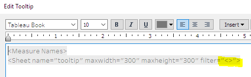
Further, adjust the tooltip so it contains the tooltip sheet; remove all filters in the tooltip like this:
Create the dashboard
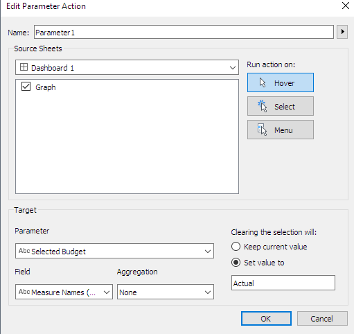
Put the line chart sheet on your dashboard and – in order to easier see what is happening – show both parameters.
Create two parameter actions. One passing the index from the line chart to the p.index parameter, the other one passing the budget name to the Selected Budget parameter and from there via the above case calculation defining which budget we want to compare to the actuals:

And that’s it. Now you can compare the running_sums of the actuals per month vs the budget you are hovering over.
One caveat: hover actions are comparatively slow, so it might be that you need to hover, move your mouse a little and hover again until the values show.
As always, if you’d like to follow along feel free to download the file from my Tableau Public profile here https://public.tableau.com/app/profile/steffen2460/viz/comparingtablecalcsfromtwodifferentsheets/DB#1
Thanks for reading and I appreciate your feedback.
Until next time
Steffen

Leave a comment