For today I have something hopefully interesting for many.
A Waterfall chart is a quite common type of chart whenever we look at financial data but obviously can be used in many regards.
In any case, it always does the same: it explains how we come from a starting reference to an end value by showing the deviations.
These deviations thereby can be for either one measure over time or across the members of a dimension or for multiple measures or both. It can have intermediate results and usually will look something like this:
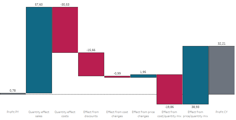
In some cases you can built a waterfall using stacked bar charts but usually, it is built using a Gantt chart where you have a starting value field and then the bar length field. The starting value defines where the Gantt chart starts and the length will expand the bar down or up depending on the movement direction.
There are several ways to do a waterfall, why would I need this one?
You will most likely need to use this approach when you want to
- Show several measures
- with their changes y-o-y
- and be able to filter your waterfall…
- but not by using a parameter
- and you cannot use relationships..
- maybe you are not allowed to add additional data (sources)
- and potentially you want to filter across data sources (a common case when creating dashboards)
Without further ado, let’s jump right into it.
Task: create a waterfall that shows the effects y-o-y from, inter alia, sales, material costs, discounts and order quantity
Start with building a year parameter.

Now, we need a scaffold on which we can base our measures and according calculations.
Since we want to be able to filter using real filters and possibly even across data sources (we will skip this in this exercise but rest assured, if you build it correctly, you can filter using other data sources with “All using related data sources” feature from the filter options).
One more note: I am using sample superstore where I included some further calculations to derive some more faked infos on the products and their profits, costs etc. You can check the workbook on my Tableau Public.
Using Internal Data Densification to build a scaffold
Create a calculation like this:
//01. Data Densification
IF year([Order Date]) = [p.selected_year]-1 THEN 1 ELSE 9 END
Where 1 and 9 define the total number of our measures we need, in this case our starting year profit, the selected year’s profit and the measures / effects in between.
Convert it to a dimension (right click –> dimension) and then proceed to create a bin from this field:

Follow up by building the profit calculations for the selected year and the previous year.
//03. Profit selected year
IF [p.selected_year] = YEAR([Order Date]) THEN [Adjusted  profit] END

//04. Profit previous year
IF [p.selected_year]-1 = YEAR([Order Date]) THEN [Adjusted  profit] END
So far, what we have done is to create 9 points that we can use to further build our visualization. Let’s see what happens if we bring all of them together:

Looking pretty good so far, doesn’t it?
On a side note: if you are not seeing points 2- 8 then right click your [02. Data Densification] pill and select “show missing values”.
But how do we access points 2 – 8?
That indeed poses a problem because we simply cannot use bins in calculated fields:

This problem we will encounter no matter what condition we try. Sad, isn’t it?
Behold and trust the power of table calculations
So, here is what we do to circumvent this problem. Create a simple calculation which includes nothing but an index() formula.
Important: the next screens are just to show that in theory it would work, they do not encompass the calculations we are finally going to use and they use less points. It is just for illustration of the concept:

But there is always a problem. No matter what we do to our table calculation, we just cannot get the values for 2-5 to show.
However, watch what happens if we wrap our calculations in another round of table calculations:

Notice how values for bins 2 and 3 suddenly show values whilst those that we did not yet enclose in table calculations still go unconsidered? The reason is that now we are back in line with the order of operations.
Before moving on, lets build our movement calculations
Generally, my approach on this is simple. My calculations include a “what-if” based on the previous year where I simply adjust one parameter at a time on a ceteris paribus (all else equal) basis to identify one effect at a time.
Note that I have made several calculations which I am not going to run through all, you can check on them on the workbook that I have made available on my Tableau Public.
I will just show you one of these so you get a feeling for my approach but first, some support calculations.
// TF is CY
[p.selected_year] =YEAR([Order Date])

// TF is PY
[p.selected_year]-1=YEAR([Order Date])
Now, on to the actual calculation
// 01. Effects from quantity - Sales
// All else equal, what would have been the sales effect just from quantity changes?
(sum(if [TF is CY] then [Quantity] end) - sum(if [TF is PY] then [Quantity] end) )
*
sum(if [TF is PY] then [WEIGHTED price per product] end)
Side note: you will see the [WEIGHTED price per product] which is yet another calculation I did (yes, on some products the prices indeed do change in the years and orders in sample superstore). Feel free to check on it in the workbook.
So, the calculation checks the difference in quantities and then multiplies them with the previous year’s price, yielding us the effect from quantity changes.
After we have created all our effect calculations, what’s next?
So, assuming we have created all our effects calculations, how do we proceed?
Contrary to usual approaches, we will NOT start by calculating the starting values for our gantt charts but rather start by calculating the length of the bars. You will understand very soon why this is sensible.
//bar length (EXAMPLE)
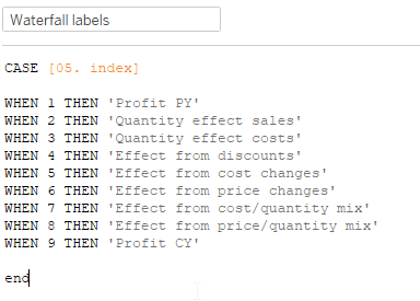
CASE [05. index]
when 1 THEN -sum([04. Profit previous year])
WHEN 2 THEN -window_avg([01. Effects from quantity - Sales])
WHEN 9 THEN -SUM([03. Profit selected year])
Else 0
ENDWhat happens, if we try such a formula? Assume WHEN 3. to ELSE conditions are also filled in.
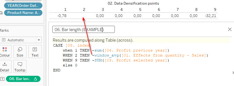
As you can see, we get a null value in return. Why is that?
Let’s break down our calculation [01. Effects from quantity – sales] in it’s parts and put those in the table as well:
//part 1
(sum(if [TF is CY] then [Quantity] end)

//part 2
- sum(if [TF is PY] then [Quantity] end)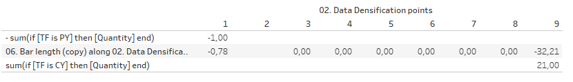
Notice how each of the parts results in their respective parts of our data densification field where we defined that 1 should be if the year equals our parameter -1, i.e. being the previous year, and 9 is to be used for the current (i.e. the selected) year.
As you will notice, these two never match each other row / column wise which means they cannot be subtracted from one another as we do in the calculation.
Overcome the problem using EXCLUDE
For this, Tableau has the nice option of using EXCLUDE LODs. We will need to wrap all our calculations into an EXCLUDE to make them work. Our final “bar length” calculation will therefore look like this:
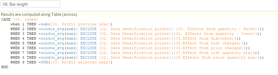
Exclude removes the granularity imposed by the data densification points (it literally excludes it from the calculations).
Can you guess why we use window_avg instead of window_sum in the calculations?
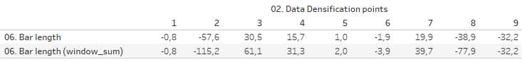
Above, I have replaced all window_avg with window_sum. As you can see, the values are doubled. Why is that? Well, simple: because we exclude the data densification points all calculations will now be done twice. Once for point 1 and once for point 9. Thus, if we sum them, we get double of what we actually want. Therefore, use the window_avg, not the window_sum.
Last step: built your starting values calculation and the chart
I had said earlier that we will create the starting values for our gantt chart last. Due to our now existing bar length calculations we can do this quite easily:

Isn’t that charming? I think so. Add two more calculations for optical appeal:

Lastly, build the chart by moving the pills as shown. Untick “show header” from [02. Data densification points], set the size of the bars to be (almost) maximum.

My [Region] filter is set to context because several of my underlying effect calculations are based on fixed lods.
The shown [TF product exists in both years] calculation is only for this specific chart as I want to make sure the user can only select products that exist in the selected as well as the preceding year, otherwise the chart would be empty.
Find the workbook on my Tableau Public.
And that’s it, you are done. You have now created a waterfall with multiple measures year-over-year that can be filtered using real filters thus meaning you can also use the cross-data source filtering functionality.
I hope you find that useful and as always, appreciate your feedback.
Until next time.
Steffen

Leave a comment