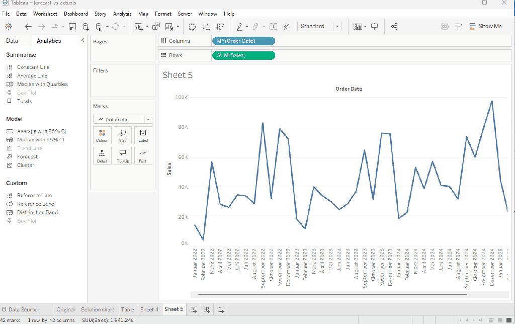
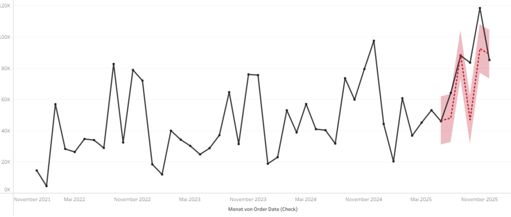
Tableau offers some “out of the box” forecasting options. And while these will not be as great as advanced machine learning approaches, they still can offer some guidance on how – for example – your sales might develop.
Adding a forecast is simple: as long as you have a decently filled timeline (notice: I will not go into all caveats as this is not the topic of this posting) you can just go to analytics tab and add a forecast.
Tableau will instantly select the best fitting model and provide you with a forecast includnig some options to tweak it on minor levels.
In tablular form, we can set the forecast to provide us with all the information shown in the graph by adding the sales forecast, then right clicking it and checking for example lower or upper prediction result, the precision etc.

Adding these one by one will give you quite a nice overview of what Tableau considers a possible forecast.
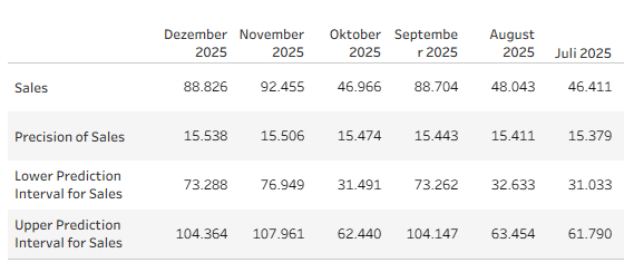
The “Sales” row here is the prediction whilst the precision is basically the +- that is applied for the upper and lower intervals within the selected confidence interval.
Now whilst this might look quite convincing (its a lot of numbers, some nice intervals etc) it does not really answer the question how well this prediction covers what actually happend. I.e. we are lacking what in machine learning is the validation step.
In ML we usually have train, validate and test data sets where the train set is used to train the model, then we validate it with a validation set (i.e. we compare actual results to what the model predicted for example the same time period) and then we apply the trained algorythem onto our test data set.
Sticking with above example, we would want to see how our actuals (in this case I am using sample superstore, so we already have the sales values for July to December 2025) compare to the forecast Tableau created based on Jan 2022 to June 2025 data.
The challenge
The main obstacle we have to overcome is that when adding a forecast, this is always applied towards the end of the period in your view.
I.e. sticking with Superstore 2025 data, our forecast will start after 31 December 2025. We can, of course, artifically reduce our period by filtering out for example the last six months of 2025 and boom, the forecast will start in July 2025.
However, this still leaves us with the challenge on how to add our actuals. The forecast will simply start after June 2025 but our actuals will also be filtered.
You might consider adding something like
if DATETRUNC('month', [Order Date]) < date('2025-07-01') THEN [Sales] ENDand we get (shortened)
But if we add a forecast, we get this:
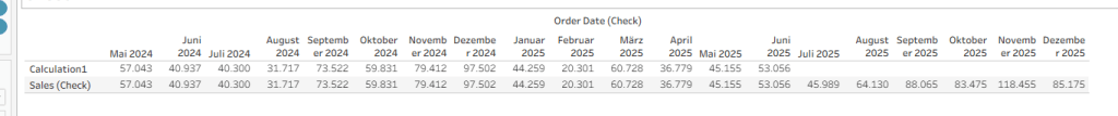
As you can see, Tableau will just continue forecasting as per the last available date in my view, not per the last date per individual measure.
The only option to somewhat get an impression – at least visually – for the forecast accuracy I found is the following approach:
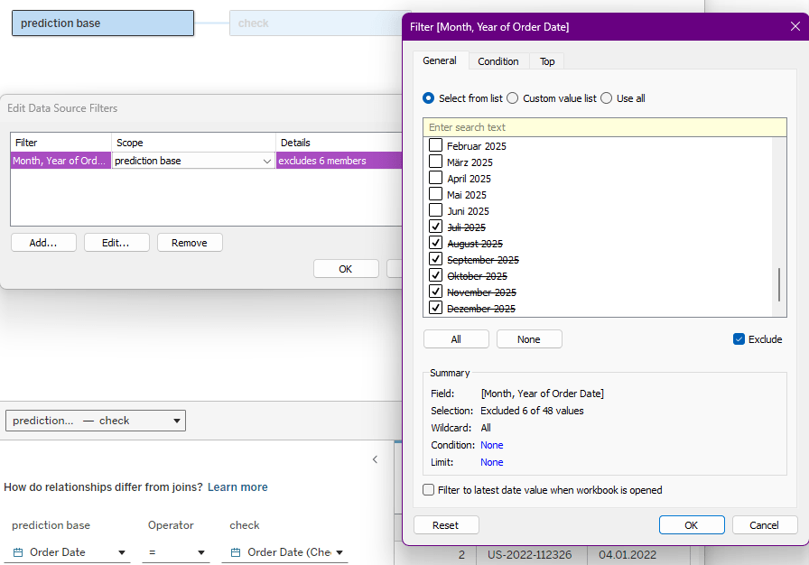
Relate your data to itself. Here I related Sample SuperStore to itself using the order date field
Then, add a date filter on one of your related tables and scope it explicitly for only that table. I named this table “prediction base” and the other, unfiltered, table is my check table.
Now create a new sheet.
Add the Order Date from your check table to the columns and set them to be continous Month field.
Add sum of sales from your check table and sum of sales from your prediction base table.
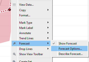
Go to Analytics and drag the forecast onto your view. This will add the forecast to both your line charts.
Right click the forecast line and select “forecast options”.
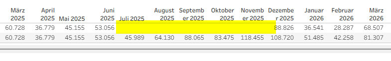
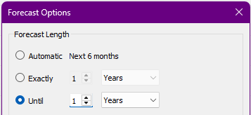
Set it to be “until 1 year”. Also, set “ignore 0 last month”.
This way, the forecast on our prediction base (that we reduced by 6 months) will end by the end of 2025, i.e. correspond to the data we have in our check table. .
At this point, your chart should look like this:

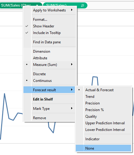
Now, right click on the pill for the sum of sales coming from the checks table and go to forecast result –> none
Your timeline should be aligned now to the end of 2025.
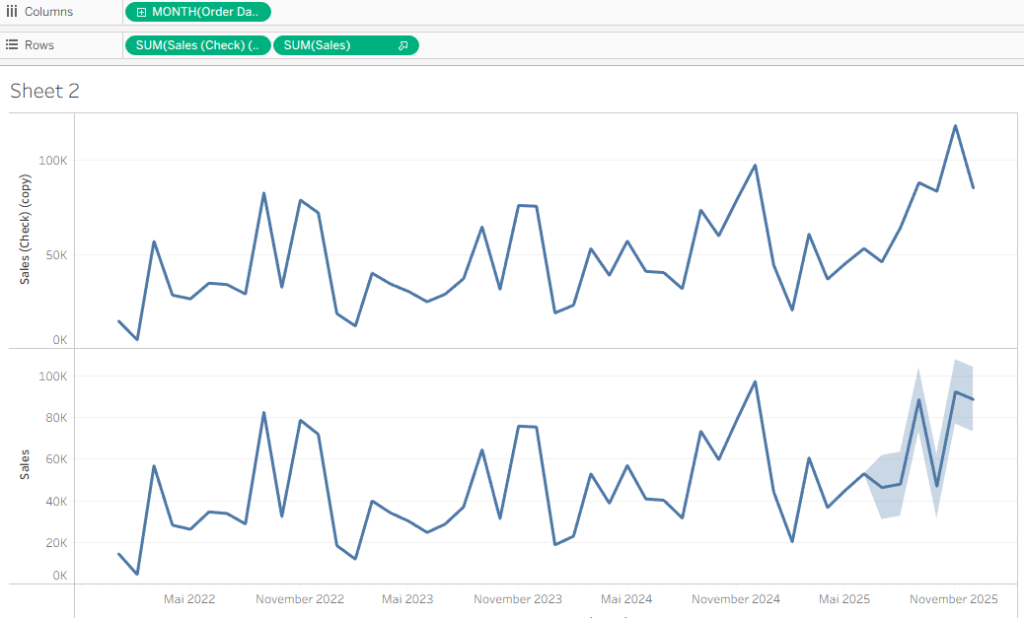
Now all there is left to do is make it a dual axis (right click, dual axis) synchronise them, format a bit and you will get this result, giving you some visual impressions of the forecast quality.
Sadly, since we cannot use either the “forecast indicator” field that Tableau creates nor the actual forecast fields and the only way to show both at the same time is by using two axis, I was not able to find a way to also put this in a table and do calculations on it. We cannot use them in calculations, we cannot reference it in table calculations. So, visual guidance is all we can provide at this point. Interestingly, we can download the data including actuals and estimates, though. So, you might do some checks using Excel.
And that’s it for today.
Maybe a bit niche, but whatever.
If you have alternative approaches (apart from “don’t use Tableau for forecasting”) let me know, I am curious to hear.
I hope you found that useful.
As always, appreciate your feedback.
Until next time.
Steffen

Leave a comment