Welcome to our final and conluding part of this mini series on table calculations.
In Part 1 of this series we derived a basic as well as advanced understanding of table calculations which we further augmented in Part 2 by gaining some insights into data padding and domain completion, i.e. data densification basics.
Now let us go on and apply this newly acquired knowledge to the WOW2024-W15 challenge where Andy Kriebel asked us to create a dynamic trellis chart using mock data for fake boybands and their social media interactions.
Table calculations – where are they in this challenge?
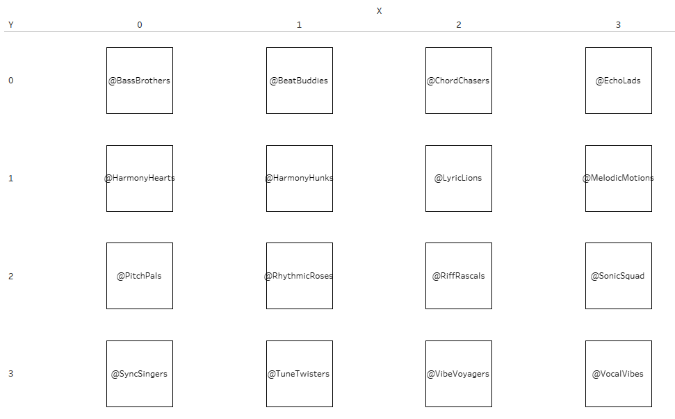
For a trellis chart to work, we need to split our rows and columns into smaller segments so we get these nice little boxes.
In our case, we have the fake boy bands, 16 of them, and therefore, splitting them into a 4×4 grid makes sense.
We can do so by creating
//X
int((INDEX()-1)%4)
and
//Y
int((INDEX()-1)/4)
You will notice there is an index() in both of them and that means: Table calculations.
In order to split X and Y into the boxes, we need to calculate the values based on…..? Right, the boyband (here: instagram handles). But there is more to it since we also need to have the months in play and the years as Andy’s challenge included showing a year over year comparison along the months.
Let us take note of some pieces to the challenge and then let us see how we can apply our acquired kowledge from part 1.
- We need table calculations to create our 4×4 grid as stated initially
- Each resulting box shall represent the instagram handle of one of the fake boy bands.
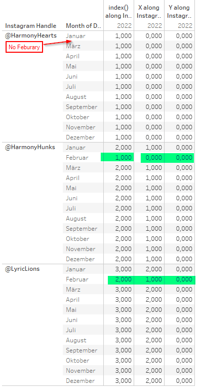
- There are missing data points for some boy bands within some years. Example HarmonyHearts have no data point for February 2022.
Creating the Grid
We start by adding our X and Y calcs on cols and rows and adding our instagram handles on the details as we want to split X and Y. Right click X and Y and set both of them to compute using instagram handle and we get this. Looks quite good.
Adding months, years and measure
Now add the year of Date to color (we want to split the years), add the month (Datepart continuous) to the columns and a measure of your choice to rows for the line chart.
Tableau will automatically add the month and year to our table calculation as a partition.
The result on first glance looks quite promising (screenshot is only partial):

When we hover over the lines the values seem to make sense but notice on col 0, row 1 (Harmony Hearts) the two single dots. The dots represent (in this case) not Harmony Hearts but Harmony Hunks!
This error carries on because the February and December dots in HarmonyHunks (Box 1/1) is from the next band, named LyricLions. And so it carries on..
So, this is a) not correct and b) a stark reminder to always verify your visual results, especially if they are not obviously not what they should be.
Why is that – and how to fix it?
The first reaction to what we observed might be to just add everything into the addressing but then we get a long, long list of Y values as our index just increments along all instagram handles (16) for two years (2) and each month therein (12) which results in 384 as our max index which divided by 4 is 96. Applying this to our Y-calc the last Y-value for our grid we would see is 95. So, not exactly what we want.
Instead of just blindly trying to figure things out by trial and error, let’s take a step back and think this through:
We know we need 16 boxes which means a 4×4 grid.
We know we had those when only instagram handles where in play.
We know we had them when adding month and year and partitioning by them but got false results on our line chart.
We know when adding more dimensions to the addressing, be it month or year or both, we increase our indexes far too much.
So, before discussing the solution (if you were reading carefully, you may guess it already): why are Harmony Hunks shown within Harmony Hearts when partitioning by month and year?
We know we are missing the month of February in 2022 for Harmony Hearts.
As you can see on the next screen, by partitioning on Year and Month, the index, which ultimately defines our boxes, starts at 1 for Harmony Hunks in Feb and carries through then to the next bands. Which is why everything is always off by 1.
We have learned that when using a table, we can use Tableau’s Domain Padding for this by applying the “show empty rows” feature.
But, we also learned that this does not work when a dimension is not on columns or rows but on details.
This leaves us with…
Two options to fix it
Option 1: Making use of At the Level
We have seen that “At the Level” will basically ignore any addressing fields that come after the “at the level” field that we selected.
We also noticed that this is exactly what we need since when having all fields in addressing, our index increments far too much leaving us with exagerated Y-values and on the other hand, when putting year and month in the partitioning, we face the just discovered problems.
So, make sure you address all three fields (tick them),then put instagram handle on the very top and set “at the level” to use instagram handle for X and Y calculations.

Option 2: Domain Completion
We can alternatively use domain completion whilst keeping year and month on the X and Y caclulation set as the partition.
To overcome the problem we encountered of the missing month of February in Harmony Hearts, Domain Completion is our friend.
Since we noted already that Tableau’s automatic Domain Padding does not work when our dimension is on the details we need to add in index calculation to our details as well.
Here, it is of high importance to NOT have any partitions in this specific index calculation but to be addressing all fields. By addressing all fields w/o any partition, we make use of the missing February being present not in Harmony Hearts but in some other bands. Domain Completion can then do its job.

As the final step, let us compare our results.
I have simply layered both sheets on top of one another and coloured them differently. All going well, we should only see two colors of the higher up sheet.
The only difference we find is in Box 0/1 aka Harmony Hearts where we see the blue line. This is because when using At the Level, we skip February whereas with Domain Completion, we add it, and it has null in it and therefore is shown (in my case) as the default value of 0 (dark orange line).
Apart from that no other colors showing anywhere so we can confirm both solutions result in the same.

You made it!
This concludes the series on table calculations and their practical application.
I hope this series has generated some “aha”-moments for you and helps you better understand the intricacies of table calculations as well as their application within an practical example.
And that’s it for today. I hope you found that useful.
As always appreciate your feedback.
Until next time.
Steffen

Leave a comment