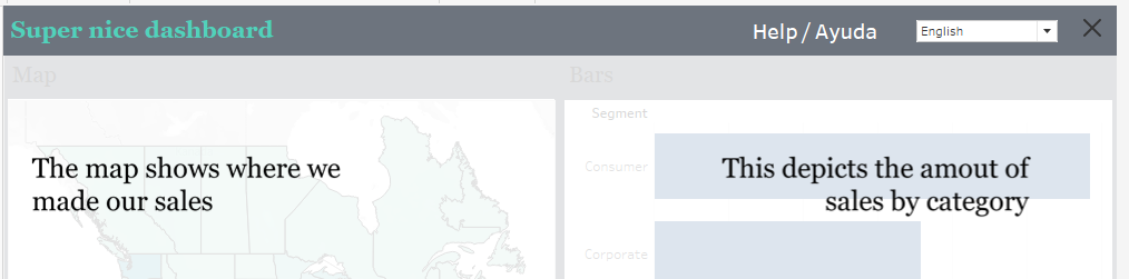
Dashboards often come with supportive overlays that help users to better understand the charts, data or even insights they are looking at in order to make the most of the data provided (and eventually: to make the most of your work as the designer of the dashboard).
Let us leverage the utility of these overlays even more by creating overlay in multiple languages.
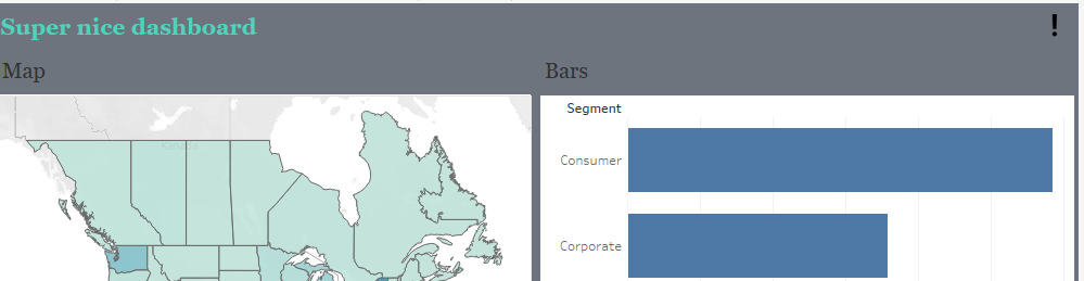
Start by creating a dashboard of your choice.
- Take a screenshot of your dashboard.
- In default of any proper alternative at hand, I tend to use simple Powerpoint to create my overlays.
- Open Powerpoint (or do the steps accordingly in your program of choice), insert the screenshot just taken.
- Add a box with same outlines around it.
- Place your comments at the right positions.
- Remove the screenshots, remove the coloring from your box.
- Select all (your text boxes, pointers, whatever you created) and the box. Right click, “export as image”.
- Re-import that image, set the background (usually white) to be the transparent color.
- Save again, now you have a transparent help overlay.
- Do the same for all other languages you want to provide.
In your dashboard, float a vertical container on top of everything else.
Within that container, I tend to put a horizontal container in which we will put all we need.
Before we continue on the dashboard we need to..
Create our help overlay sheet
On that sheet, add “1” to rows and columns and set to AVG(1).
Next, create a parameter with your language choices you want to offer:
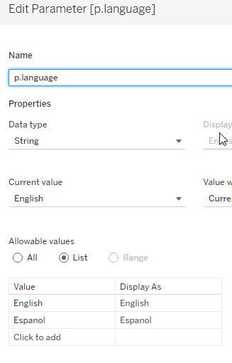
Create a calculated field that is nothing else but a mirror of this parameter like this:
Put this field on the details. Set the mark type to TEXT as this will make your help overlays clearer (don’t ask me why, but it does).
Untick “show header” on your rows and columns.
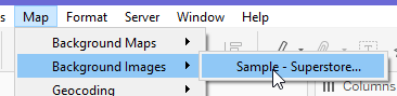
Now, go to “Map” -> “Background images” –> “Your data source”
Click “add image”.
Next, browse for the first image you want to insert.
Leave X and Y fields blank but set Right to 1.
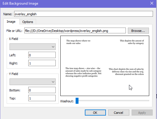
Next, go to options, tick the two options available and add a condition.
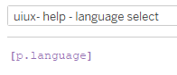
Select our “uiux – help – language select” field.

You will be greeted with request to select an option which at this point will mirror the value you have selected in your parameter. Select it (it should match to your image that you insert, if not, stop here, change your parameter value so it fits the image and go again).
On the next step, change your parameter to the next language, run through the process again. Repeat until all your intended languages are set.
In the end, it should look like this

Right click the sheet, go to format, then on the left select “shading” and set worksheet to “none” (standard is white).
Back to the dashboard
On our floating overlay, in the horizontal container I tend to insert a blank (this will usually be to move things to the right and keep headlines / brand icons etc free of clutter). then a textfield that states “help” in the needed languages. Besides that, put our parameter. Make sure that it is nicely aligned by using outer padding on the top only. End with another blank.
In the vertical container, move our help overlay dashboard to the bottom part.
Your item hierarchy should look like this:
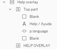
Click the “HELP OVERLAY” and set the background to white and 80% opacity. This will give your overlay sufficient distinction from the actual background but keep it slightly visible so people recall what the hint they read is for.
Finally, select the vertical “help overlay” container and add “show/hide button”. Float this one on the very top over the blank on the right, adjust its layout as needed.
And with that, we are done.
If you want you can find the workbook here on my Tableau Public.
And that’s it for today. I hope you find this useful.
As always appreciate your feedback.
Until next time.
Steffen

Leave a comment